THE SCRATCH USER INTERFACE
In broad terms, the SCRATCH is divided into these compartments: the Startup screen, the Construct (manage your media/timelines), the Player (containing the Editor and ColorFX) and the Render section. Throughout each of these sections, the SCRATCH User Interface (UI) remains consistent and is divided into two distinct areas. The Main Menu panel occupies the lower portion of the screen and has a Menu Bar across the entire top. Above this is the main workspace area of the UI, called the View Port.
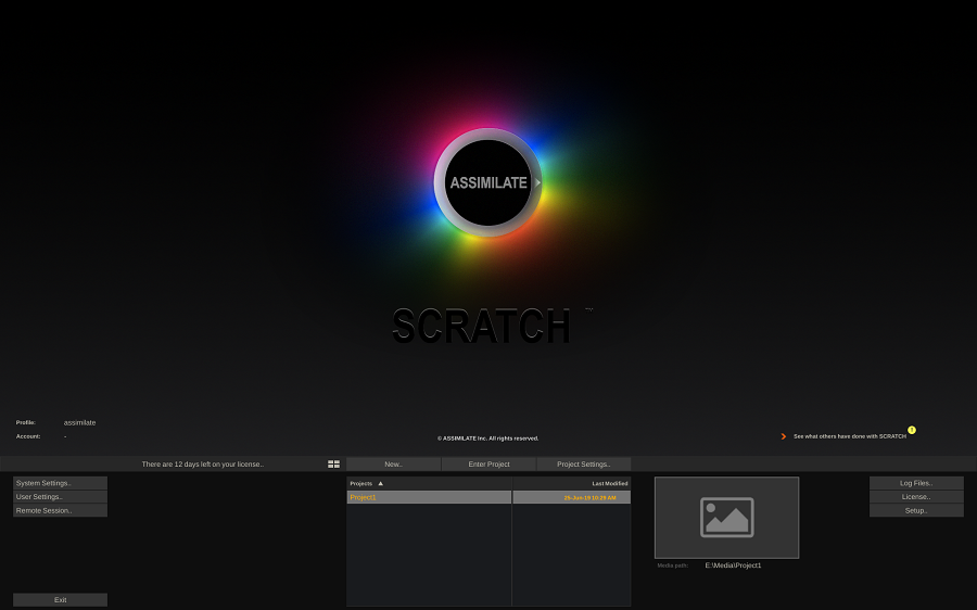
When SCRATCH is launched, the first screen you will see is the Startup Screen. The Main Menu displays Session, User, Project, and System Settings options.
Tip: The View Port area of the Startup Screen can be customized with your own logo. See Chapter – CUSTOMIZING SCRATCH for more information.
UI COMPONENTS
Navigating through the SCRATCH UI is done with several types of elements and functions:
- Toolsets
- Tab Navigation
- Gestures
- Single-Action Buttons
- Menu Buttons
- Pull-Down Menus
- Text-Entry Slates
- Text Selection Slates
- Numerical Slates
- On-screen Calculators
- Tooltips
- Re-position and Size Elements
- Hyperlinks
- Color Selection Palettes
- Special Purpose Interface Elements
- Quick Keys
TOOLSETS AND TABS
When you entered a project in SCRATCH the bottom part of the UI has a number of tabs to navigate through the various sections in SCRATCH. To the left of the tabs you can select a specific Toolset that is suitable for your workflow.
Available Toolsets (depends on the version / SCRATCH license):
- Finishing/Full. Complete function set.
- Dailies/CDL. Simplified set of grading tools / no editing.
- Player/review. Clip / media setup and basic grading tools.
The 4 basic tabs in a full SCRATCH version are:
- Construct: timeline and media management.
- Edit: NLE.
- ColorFX: color grading and compositing.
- Render: manage multiple outputs and render timeline media.
In case of a derivative version of SCRATCH or certain Toolset, one or more of the tabs above could be replaced by:
- Player: media / clip setup and basic grading controls.
GESTURES
SWIPING
SCRATCH uses a method called ‘swiping’ to control various UI elements. A swipe simply means to move the cursor quickly off one edge of the UI. When the cursor hits the edge of the UI, whatever swipe action is attached to that edge of the UI will be executed. This may consist of revealing a menu or clearing a selection. You’ll see swiping referred to in many places throughout this manual. Note that there are User Configuration Settings to switch off swiping in the Construct and the Player.
To
give a hint as to which edges allow for a swipe action, SCRATCH will display a
swipe handle when the cursor is in proximity of the edge. Instead of a swipe
gesture you can also click the swipe handle to invoke the associated action.

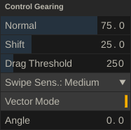
CONTROL GEARING
Control Gearing is a gesture for incrementing and decrementing Numerical Slates, similar to using a radio dial. See the section NUMERICAL SLATES for details on how Control Gearing is used.
SINGLE-ACTION BUTTONS
A single-action button performs one action when clicked. Examples of these are the EXIT and ENTER PROJECT buttons shown on the Startup Screen. If a button is grayed out, then the function that button performs is not currently available.
CONFIRMING SINGLE-ACTION BUTTONS
Some single-action buttons will require a confirmation to ensure that you really do want to perform the operation. In these cases, the button will be replaced by a confirmation button, which is really two buttons in one.
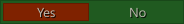
Click on the Yes / OK / Accept part of the button to confirm the action or click on the No / ESC / Abort part of the button to cancel the action.
The Quick Key - Enter on the keyboard can also be used to confirm the action.
Moving your cursor off the button will cancel the action automatically.
MENU BUTTONS
Menu Buttons are used to select between different sub-menus within the Main Menu. The Menu Button will highlight to indicate which sub-menu has been selected and the Main Menu will update to display that sub-menu.
An example of this are the four Menu Buttons on the left side of the Startup Screen; Session, User Settings, Project Settings, System Settings. Each of these will call up a different sub-menu.
PULL-DOWN MENUS
Clicking on a pull-down menu will open a list of options for that button.
The currently selected option will have its text highlighted. The option under the cursor will have the background of the button highlighted.Options that are not available will be grayed out.
Click on any option to select it and close the list.
Tip: Pull-down menus will stay open after a single click with the mouse or pen. There is no need to keep the mouse or pen pressed while selecting from a pull-down menu. This makes the SCRATCH UI easier to use with less strain on the muscles of the hand.
TEXT ENTRY SLATES
Text Entry Slates are areas where specific alpha-numeric information can be entered. They are flat, non-shaded areas. Examples of Text Entry Slates are the New User and New Project areas on the Startup Screen.
Clicking on a Text Entry Slate will change the cursor from the default cross to an I-Beam, indicating that the software is ready for text input. Text can then be entered from the keyboard and confirmed with the ENTER key, which will end the text input.
Note: Be sure to hit ENTER after completing a text entry. Clicking on another part of the UI will revert the text entry back to its previous version and cancel any new text entry.
Tip: Text Entry Slates follow all of the usual text editing rules for Windows such as Cut and Paste (using CTRL-C and CTRL-V), partial selection, backspace etc.
Note: SCRATCH maintains a history of values entered in Text Entry Slates. Using the Quick: Key Up and Quick Key: Down arrow keys while a Text Slate is selected will scroll through previous values entered in any other Text Slate in SCRATCH. The history is maintained until exiting a Project. This function can be very useful when updating multiple Text Slates with more or less similar values - e.g. renaming a number of shots.
LANGUAGE SPECIFIC INPUT - SPECIAL TEXT INPUT (IME)
As of v8.3 SCRATCH has full Unicode support and support for Windows / OSX language special text input methods (IME). SCRATCH will automatically pick up on your OS input settings as well as the use of modifier keys to enter special characters. Further, the Burn-in / text plug-in supports unicode text input and UTF-8 formatted sub-title files.
Depending on your specific language - the default interface character font for text entry might not support certain characters. By default SCRATCH will attempt to use a fall back font to display the characters. If However SCRATCH can not find a suitable fall back font - then you can manually set a different interface font. Please see Chapter - Customizing SCRATCH for details.
TEXT SELECTION SLATES
Text Selection Slates are lists of options that can be selected. They are similar to a pull-down menu except all options are visible at all times rather than having to click on a single button to reveal the list.

Text Selection Slates cannot be directly edited; however, the text they contain is usually controlled by a Text Entry Slate. Examples of Text Selection Slates are the Users and Projects lists on the Startup Screen.
NUMERICAL SLATES
Numerical Slates are used for inputting numerical data for various properties. You can input or change a value of a Numerical Slate in several ways.
CONTROL GEARING
To use Control Gearing, click and hold over the current number in a Numerical Slate and make a circular motion with the cursor. This will act as a control dial which will increment (clockwise motion) or decrement (counter clockwise motion) the numerical value. You can hold down the Quick Key: Shift to change the sensitivity of the control gearing.
The sensitivity of the Control Gearing and Shift-modifier can be customized as a User Setting. See Chapter 3 – THE STARTUP SCREEN for information about how to change these values for each User.
The Numerical Slates have a Fill Gauge that indicates where in the overall range of values the current number falls. The Fill Gauge will gradually fill in the area behind the Numerical Slate’s label. Once the Fill Gauge moves to the right edge of the label, the maximum value has been reached and the value cannot be incremented any further.
CALCULATOR
Clicking once on the number in a Numerical Slate will invoke the SCRATCH Calculator.
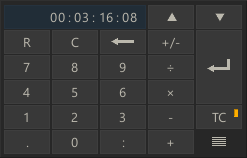
Tip: You can move the Calculator’s position by clicking down on the gripper in the lower right of the Calculator panel. If you hover over the gripper,the main cursor will change to a translate cursor, indicating that repositioning is possible.
To enter a new value, simply click on the appropriate numbers and click the enter arrow. You can also use the number pad on the computer’s keyboard to enter values. The numerical entry will update after the Enter key is pressed.
To remove a single digit entry, click on the backspace arrow; or, to clear the Calculator’s entire Entry Slate, click on the C button.
Illegal Value Indicator
If you attempt to exceed a value’s upper or lower limit, the Calculator displays the number in red. Use Clear or Backspace to set the Slate to a legal value. If you hit ENTER, the maximum or minimum value will be inserted automatically.
Increment and Decrement
To increment or decrement an existing value by a pre-defined amount,first enter the amount and then click on either the up or down arrow at the top right of the Calculator panel. Each click on the arrow will increase or decrease the current value by the amount you typed in, and the Calculator will display an equation representing the current increment or decrement.
Tip: By default, the increment and decrement are set to 1.
You can also use the following Quick Keys: Arrow Up/Down and Quick Key: Right/Left to increment/decrement the value to achieve the same effect:
Calculations
Normal calculations can be made on numbers by using the ÷, x, - and + buttons. For example, to divide the current number in half, click on the ÷ button and then click on 2 and Enter.
Numbers can also be quickly swapped from positive to negative or vice-versa by using the +/- button.
Time Code and Frames
The TC button toggles the Calculator between Frame Mode and Time CodeMode. When in Time Code Mode, values are entered as HH:MM:SS:FF, rather than as pure frame counts. This only applies to Numerical Slates that accept time codes as a value. The TC button highlights when the Calculator is in Time Code Mode.
Reset
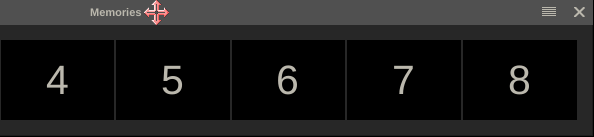
An individual value can be reset back to its default by clicking on the R button, located on the top left of the Calculator’s panel.
Magic Number Picker
The Calculator has the ability to recognize and grab any number that exists on the current menu page and place it as the current value in the Calculator. For example, if a Scale X Numerical Slate has a value of 90, and a Scale Y Numerical Slate has a value of 50, you can set the Scale X value to 50 by clicking on the current value of Scale X to open the Calculator; then click on the Scale Y value of 50 and the value of 50 is immediately entered into the Numerical Slate for Scale X. This is a quick way of matching values between different parameters without typing the entire value.
Exiting
To close the Calculator and accept the current value, press the Enter button or use the Quick Key: Enter on the keyboard.
To remove the Calculator without changing any values, use the Quick Key: Esc or Swipe the cursor off the edge of the UI.
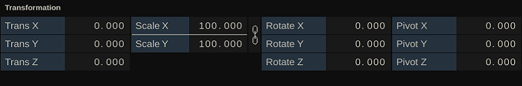
LOCKING AND UNLOCKING LINKED SLATES
Some Numerical Slates, such as Scale X and Scale Y, are locked together so that modifying the value of one will automatically modify the value of the other. This is particularly convenient for parameters,such as Scale, which typically are modified together. However, there are instances when these values need to be modified separately. To do this, first the Slates must be unlocked from one another.
Locked Slates are indicated by a connected chain icon to the right of the Slates as well as a white Link Bar in between the two Slates. In the image below, the Scale X and Scale Y values are linked.
To unlock the Slates, you either click the Chain icon or you can drag from an empty area of the UI across the Link Bar.
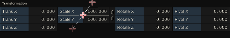
While you are dragging, a line is drawn to indicate that you are unlocking the Slates. Once the line crosses the white Link Bar, you can release the mouse or pen button. The Link Bar disappears and the Slates are unlocked. This can be done in any direction, but you must start dragging from an area of the UI that has no other interface elements on it. If the indicator line does not appear, then your start point was not valid.
Slates can be locked back together again using the same methods: either by clicking the unlocked Chain icon or by dragging across the Slates.
TOOLTIPS
When you hover with the pen over a control and hold that position momentarily, SCRATCH will popup a tooltip.
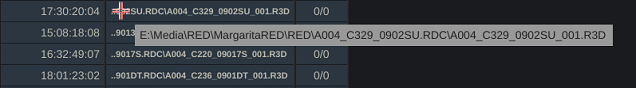
Furthermore, if text is clipped because it does not fit within a control or label area, SCRATCH will also display the full text in a tooltip.
REPOSITION AND SIZE ELEMENTS
GRIPPER
When you click and hold down the mouse button you can drag the UI element across the screen to re-position or re-size the element.
TITLE BAR
Some dialog panels can be re-positioned by dragging the title bar.
COLUMN HEADERS
The column width of data lists can be adjusted by clicking and dragging in between the column headers. When you hover over the right or left edge of a column header, the cursor image will change.
COLOR SELECTION PALETTES
There are several areas in SCRATCH where you will either need to sample a color from an image or designate a specific color. In these situations, the Color Selection Palette appears. This UI element allows you to designate a color in several ways.

RGB SLIDERS
The top row contains Sliders for Red, Green, and Blue levels. These can be adjusted by clicking inside the color area and dragging the indicator to the desired level. You can also use the Quick Key: Shift to modify the sensitivity of the sliders.
Note: The sliders response is based on the settings for Control Gearing in the User Settings menu of the Startup Screen. By default, the Quick Key: Shift will increase the sensitivity of the sliders. However, if the values for Control Gearing have been altered, the sliders will behave in accordance with those settings.
CURRENT COLOR POT
In the center of the top row of the Color Selection Palette is the Current Color Pot. This area displays the currently selected color and has the values for each color channel superimposed over it. The values displayed are based on the Color Format that is selected. See below for more details about Color Format.
Color Picker
Whenever the Color Selection Palette is visible, you can select colors directly from the View Port. When the cursor is over the ViewPort, it changes to the Color Picker cursor.
Click down on any area in the View Port; the color beneath the cursor will be sampled. You can also hold down the mouse or pen button and continuously sample colors from the View Port. Releasing the mouse or pen button keeps the last sample as the current color.
Note: Pan and Zoom controls are deactivated while the Color Selection Palette is open.
COPY
To the right of the Current Color Pot is the Copy button, which copies the value from the Average Color Pot into the Current Color Pot.
AVERAGE COLOR POT
The Average Color Pot is a running average of all colors that have been sampled since the Color Selection Palette was opened. This can be useful for sampling black areas to get an average black level for a particular portion of an image, or for selecting a median value for a Qualifier. This is covered later in Chapter 8 – SCAFFOLDS. This color can easily be copied to the Current Color Pot using the Copy button.

SAMPLE
The sample button determines how many samples will be taken around a certain point when the Color Picker is used. This is another way of quickly averaging a selection. Using more samples from around the selected pixel reduces the effect of variations caused by film grain or color sub-sampling, and gives you a more representative value for a particular area of an image. If very precise pixel value measurements are required, a sample of 1 should be used to ensure that the values returned are exactly the values of the sampled pixel.
RESET
The Reset button returns the Color Selection Palette to its default, middle-gray color. It also resets the Average Color Pot.
HSV SLIDERS
Along the bottom of the Color Selection Palette are the Hue,Saturation and Value sliders. The current color can be modified by adjusting these sliders if you are more comfortable working in an HSV space as opposed to an RGB space. The Hue slider is larger than the others in order to provide more accurate selection.
COLOR FORMAT
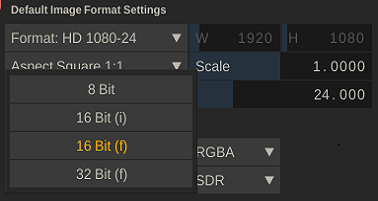
To the right of the HSV sliders is the Color Format pull-down. This pull-down changes how color ranges are expressed within the Color Selection Palette. The actual bit depth is not changed; it simply alters the value ranges that are displayed in the Current Color Pot.
- 8-bit values range from 0 to 255
- 10-bit values range from 0 to 1023
- 16-bit values range from 0 to 65535
- 0.0-1.0 values range from 0.0 to 1.0
COLOR SPACE
This pull-down will change the color space that is used to display values in the Current Color Pot. The options are RGB, HSV, YUV and RGB-LOG.
NUMERIC
The Numeric button will toggle Numerical Slates on and off for RGB and HSV values so that you can enter these values directly in addition to using the sliders.
OK/CANCEL
On the left side of the Color Selection Palette are the OK and Cancel buttons.
To accept the current color selection, you must either press the OK button, use the Quick Key: Enter, or Swipe the cursor off the left or right side of the screen.
To cancel the current color selection and return to the previous selection, you must either press the Cancel button, use the Quick Key: Escape, or Swipe the cursor off the top or bottom of the screen.
HYPERLINKS
Certain text elements in SCRATCH can contain a hyperlink to open a web-page. When you hover over such an element, it is displayed underlined and the cursor image changes. The web-page is opened in your default web browser.
DRAG MENU
In the Structure view - when dragging an element and hovering over another element - a circular menu will appear around the drop target with one or more drop actions.
You can either select one of the actions by clicking on it or click in the middle part on the drop target, which will trigger the default action. The default action is highlighted when hovering the middle part of the menu.
SPECIAL PURPOSE INTERFACE ELEMENTS
There are many other interface elements in SCRATCH that are dedicated to a specific purpose; for example, the Tracker Ball interface in the COLOR toolset.

The specifics of these interface elements is described in their respective chapters.
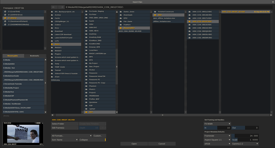
THE SCRATCH BROWSER
SCRATCH uses a custom File Browser for navigating the file system.This Browser provides specialized functions for working with image sequences and folders. The Browser will pop up over the View Port area whenever SCRATCH requires you to navigate to a particular file or folder.
NAVIGATION
Each sub-folder is shown in its own column. Select a sub-folder to open the next column and show the folders/files contained within.
You can also use the following Quick Keys: Up/Down Arrow and Quick Keys: Left/Right Arrow to navigate to the previous/next file and previous/next sub-folder.
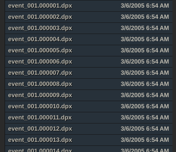
SCRATCH automatically detects image sequences and groups them into single entries within the Browser.
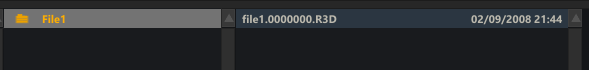
Each entry shows the base file name, number of frames in the sequence, and the date and time the files were created/modified.
RECENT PATHS
The left bottom list shows a number of recently used paths. Each time a file of directory is selected, the folder is added to the list. There are however different lists maintained, indicated by the label above the list. There are separate lists for different groups of file and folder types; image files, construct files, color and LUT files, plug-in and template files and lastly a general category.
BOOKMARKS
Next to the Recent Paths tab is the Bookmarks tab. The Recent Paths list is automatically populated. In the Bookmarks section you can create your own list of shortcuts to important folders. By default SCRATCH does maintains a few (dynamic) bookmark references - such as to the project- or users-folder. Note that some of these are only available once you opened a project. If you click a valid bookmark, SCRATCH selects the associated path in the file browser.
Clicking the Add button located below the bookmark list adds the current selected path as a bookmark and opens the Edit Bookmarks dialog to edit the label of the bookmark that was just added. The Edit button just opens the dialog.
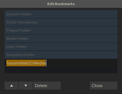
In the dialog you edit the name of a bookmark by selecting the row. When done press the Close button. To remove a bookmark, select the row and then click the Delete button. Note that any of the (dynamic) bookmarks that were created by SCRATCH cannot be renamed. Deleting them will only remove them for the session and they will re-appear the next time you start SCRATCH.
Use the Arrow buttons below the list to adjust the order of the bookmarks.
FILE TYPE FILTER
The current folder can be filtered to only show files of a certain type.
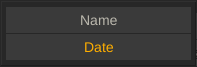
SORT
The order in which files and folders are displayed can be controlled with the SORT button. The options for sort are By Date and By Type.
COLLAPSE
By default, SCRATCH groups image sequences into a single entry in the Browser. However, you can expand the group by de-selecting the COLLAPSE button. This shows each file on its own line in the Browser.
Tip: Sometimes you may receive multiple files that are not meant to be grouped together. For example, QuickTime files with names such as;Reference_1.mov, Reference_2.mov etc. These will get grouped together by the COLLAPSE function. To see each file, de-select the COLLAPSE button.
ERROR LOG
Pressing Quick Key: Ctrl + E anywhere from within SCRATCH, will popup the Error Log panel. Any irregularities that accured, e.g. unable to load a file, will be displayed. They will also be recorded in the general log. The Clear button will only remove items from the active list in the panel. The general log is not affected.

QUICK KEYS
SCRATCH uses keyboard Quick Keys as shortcuts to many of the UI functions. A list of these Quick Keys can be called up at any time from within the SCRATCH UI by pressing the Quick Key: H or by clicking the Help button  to the bottom far right of the UI once inside a project. The Quick-Key list is context-sensitive and shows only the Quick Keys that apply to that particular area of the software. The list also provides a link to the online manual. To clear the list, press the Quick Key: H again or swipe off any side of the screen.
The complete list of all Quick Keys is available in Appendix A.